Lyft: Design System Transition
Overview
Lyft was undertaking a migration from Sketch to Figma as the primary design platform across the company. I was brought in to support the transition of the Lyft Product Language (LPL) design system and its catalogue of libraries, components, attributes, and resources. Lyft’s Sketch and Abstract licenses would not be renewed as of January 2020, and so we had a few short months to transition not only the LPL but the entire design organization over to Figma. Aside from the LPL Transition project, I also designed production ready mock-ups of golden path screens for the Consumer App team and the Autonomous team for marketing use.
My Role
I worked alongside production designer Jeremy Dizon and Android engineer Alex Lockwood to create and enhance both the presentation and efficiency of the LPL libraries in Figma. My work was focused around three key areas of responsibility.
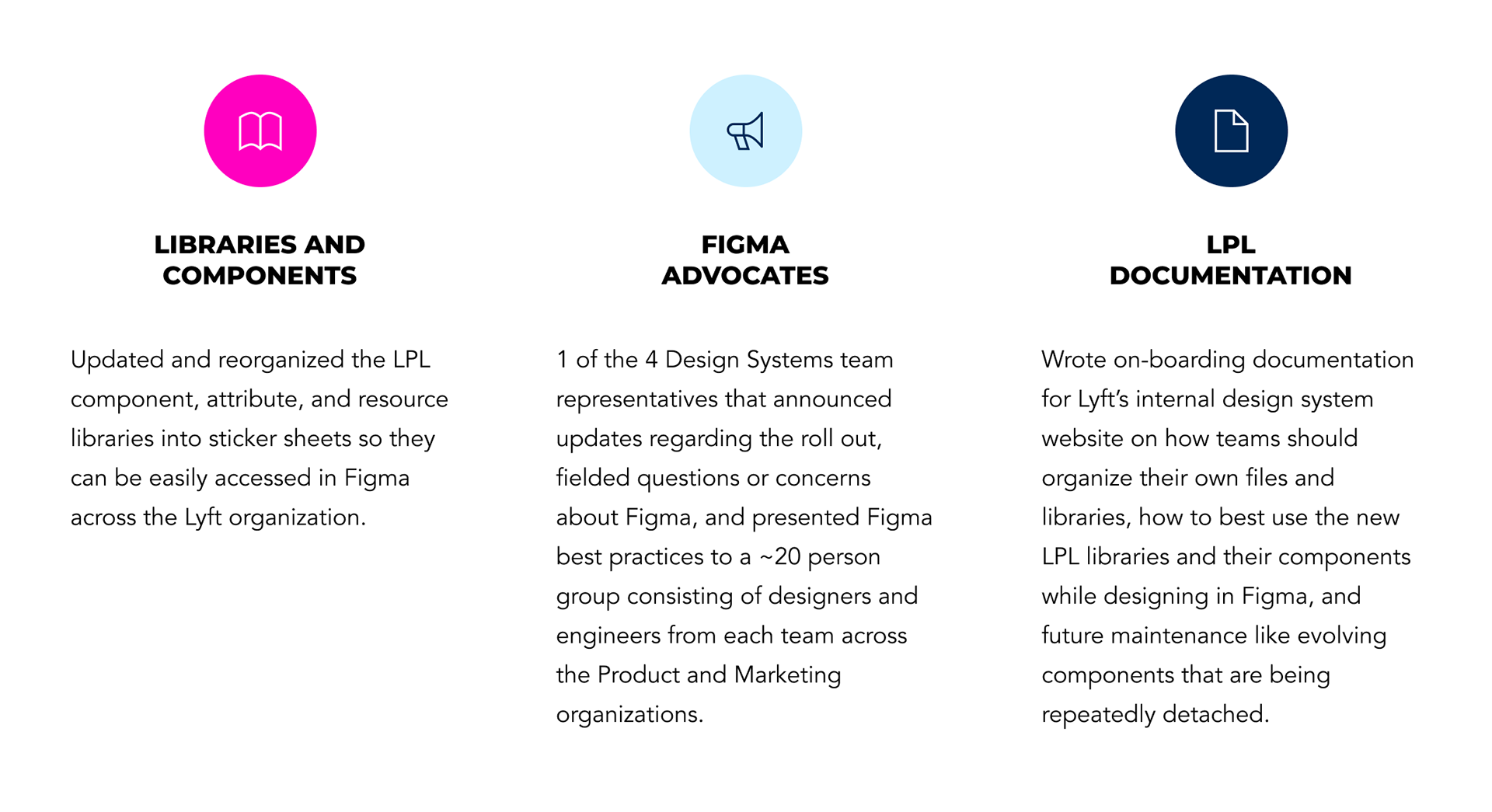
I. Libraries and Components
One of my primary responsibilities was to port current Sketch libraries from Abstract and organize them into "sticker sheets" in Figma for designers to easily create instances of main components.
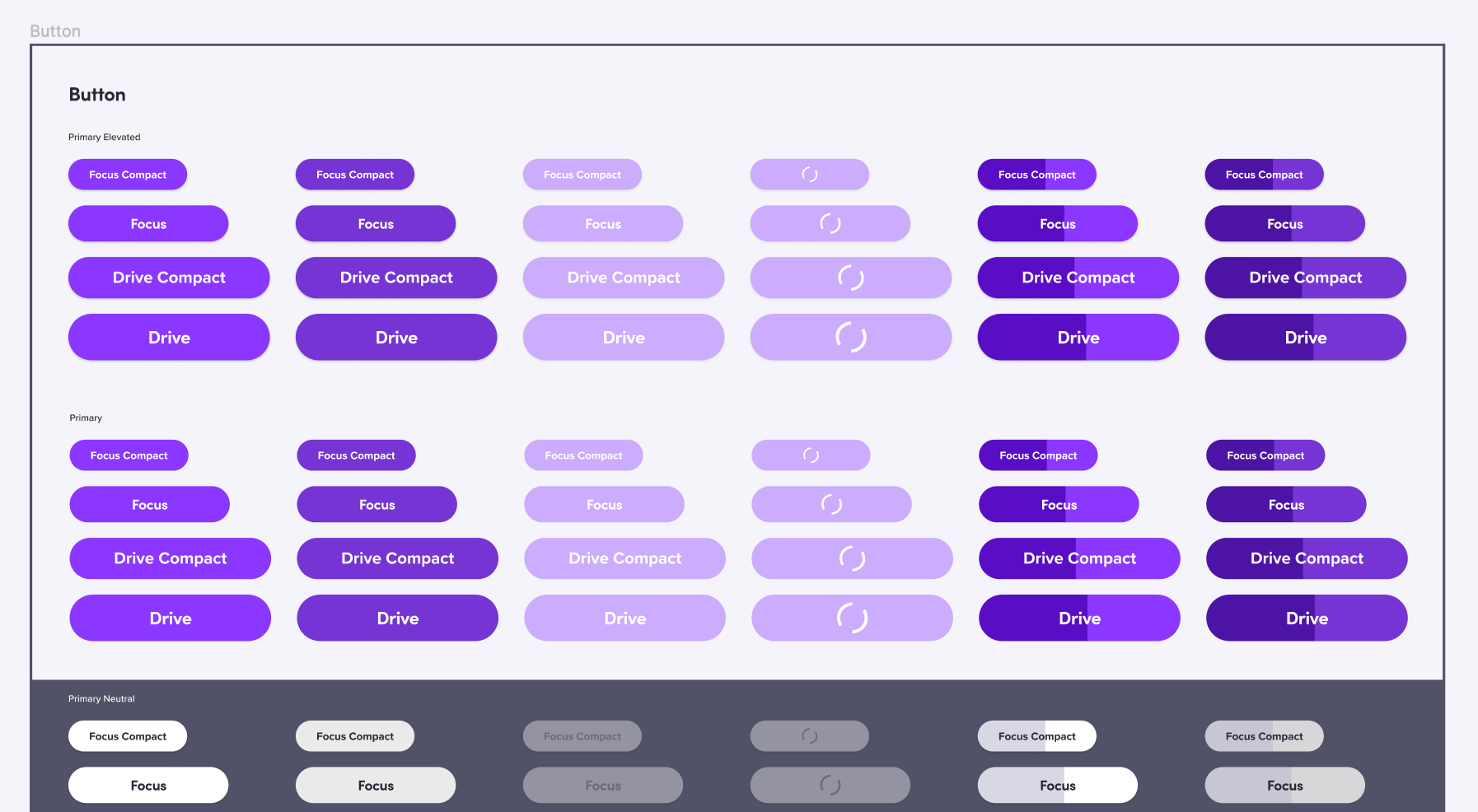
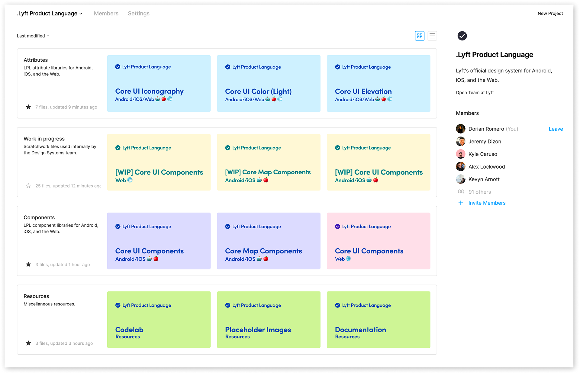
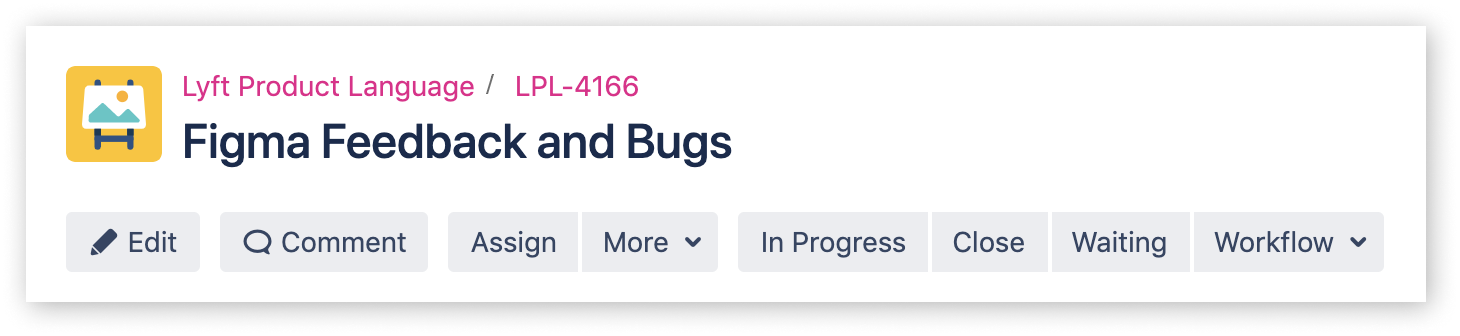
Screenshot of some of the buttons in the Core UI (Android and iOS) library in the sticker sheet model.
Sticker Sheets
This is where the LPL main components lived and where designers could come to easily find any variation (state, size, color, etc.) of a component that they were searching for. Now, I know what you’re thinking, “In Figma, wouldn't designers just search in the Assets tab for the component they are looking for?” Sure, some designers would...
However, not all designers work the same way.
We wanted to create these libraries with the designers in mind who prefer having their component file open so they can get a better view of related components than the Instance menu or the Assets tab preview offers. Or the curious designer who clicks on “Go To Main Component” because they want to find out how a certain component was made by a member of another team.
Component Organization
Our LPL library consisted of thousands of components divided into 4 “projects” categorized by:
· Components (Android/iOS and Web)
· Attributes (color system palette, icons, and elevation styles)
· Resources (Figma walkthrough for engineering implementation, images, and documentation)
· Work In Progress (working files with unpublished component updates)
With so many components, we were excited about no longer worrying about overrides and having the ability to swap components in so many different ways with Figma. Although, when using the instance panel in particular, we found ourselves at times having long menus spanning multiple columns that would overwhelm designers and cause difficulty finding a particular instance.
A solution we implemented to account for this, using our icons as an example, was strictly providing icons in a single color (Gray100) and organizing them by size and icon category. We didn’t have to provide every color variation anymore because people could simply change the color directly from the Attributes panel. This concept aligned with how icons in mockups getting handed off from Sketch were already being implemented on the engineering side.
For example, an engineer would see an icon in an error state (Red60), grab the code from the Gray100 version of that icon, and simply tint the icon to the desired hex code from the color system. Taking cues from our engineers gave us the opportunity to create parity across development processes as well as swap components more efficiently. We would go on to apply this concept to other similarly structured components.
Android and iOS Library Consolidation
An opportunity presented by this transition was reorganizing the LPL libraries in a way that took advantage of Figma’s capabilities, made it easy for people to find a specific component by implementing clear file hierarchy and naming conventions, and removed any inconsistencies (across platforms specifically). Which leads to the important task of consolidating the Android and iOS component libraries into a single “native” library to ensure platform parity (for more details check out this article written by my amazing manager, Linzi Berry) and a consistent experience for users, designers, and engineers.

This involved identifying any shared elements from separate components that can be merged to create a single one, using emojis (🤖and 🍎) in the naming convention to keep it familiar to how things were previously in Sketch, and keeping separate device components when appropriate (i.e. the home indicator for iOS and the navigation bar for Android).
To Auto Layout, or Not to Auto Layout
Halfway into our migration, Figma launched a brand new feature, Auto Layout. An incredibly powerful feature that would allow designers the ability to make text and the content surrounding it responsive, create complex components with nested elements, and bringing a CSS-like environment to a design tool. At first glance, this shiny new tool looked like something we were going to want to implement right away. However, we needed to take a step back and ask ourselves the tough question,
“Will the weeks spent updating all of these components be worth our time in the long run?”
After a few days of playing around with this new feature, we identified some potential roadblocks:
· Although it enabled responsive text, we weren’t going to be able to apply any constraints to our more complex components
· We weren’t able to edit the background fill opacity or create separate “background” layers in Auto Layout frames, which was how current components with multiple states (loading, disabled, hover, etc.) were being designed
When creating any design system, long-term maintenance should always be at the top on the list of considerations. Which is why we decided to publish Auto Layout component updates in increments based on estimated production design time and (thanks to Figma library analytics) the amount of component inserts from designers.
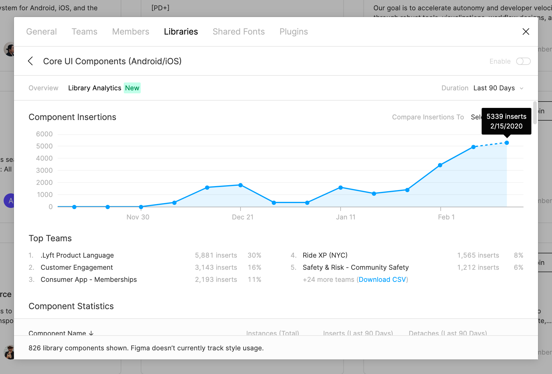
Graph of component insertions from the Core UI (Android/iOS) library from October 2019 to February 2020.
Given that we couldn’t apply constraints at the time, our solution was to use Auto Layout another way — consolidate main components that had multiple instances with content variations. Embedding the variations in the main component itself and marking them as hidden in order to give designers the freedom to reconfigure them to the appropriate use case, decrease time spent searching for the instance variation of a main component, and taking advantage of Auto Layout’s responsiveness.

Regarding the component states problem, it took a lot of discussing, experimenting, and breaking of components (yup, you read that right) to find a solution that fit our needs. For buttons that needed to have different background opacities without changing the text opacity, we ended up adding a solid white fill underneath the primary fill color. Giving us a button with a primary background layer that is free to change opacity, will stay opaque, and keep text at 100% opacity.
For loading states, we did something slightly different. Those components were currently designed by having two separate rectangle layers stacked on top of each other with the top one having a shorter width and two corners with a radius of zero to expose the bottom layer. We made this possible with Auto Layout by turning the solid fill colors into linear gradients with three color points and adjusting the width of the top fill color.

II. Figma Advocates
As some of you may know, going from working in Sketch to Figma is not exactly an easy task if you have never used Figma before. Certain elements behave differently, there are these things called “frames,” and many other not so 1:1 relationships. With a transition like this, there needed to be a space made for teams across the company to communicate in order to ensure that important information was being shared, questions from teams with a mix of priorities were being asked, and any concerns with how to best prepare for this transition were met with clear recommendations from our team. As a result, the “Figma Advocates” was created, a group led by 4 Design Systems representatives (Linzi Berry, Jeremy Dizon, Alex Lockwood and myself) and Kyle Karuso (Design Ops) that met every other week with ~15 lead designers, engineers, and managers from the Product and Marketing organizations.
Insights and Actions
The Advocates were especially important for myself and Jeremy because we were able to present our work and listen for feedback from leaders across the company to inform our design decisions and avoid making biased ones. I was also able to hear their struggles with the tool and think of ways we could potentially improve their workflow with custom Figma plugins (thanks to Kevin Arnott and Alex Lockwood) or a change in our component organization. One of the plugins that came from this was the LPL Library Linker, which was a script designed to help people easily relink any broken color and text styles as they imported their Sketch files over to Figma. Instead of spending time manually relinking everything, one would be able to select all of the artboards on a page, run the plugin, and it would automatically link the old styles to the new LPL styles that most closely resembled them.
During our meetings, the Advocates were able to take my guidance and counsel as a Figma expert in order to pacify any concerns about moving away from Sketch. I led discussions on how Figma was going to be able to make their lives easier and influenced their excitement about the transition. Once the libraries were complete and there were no more major announcements to be made to the Advocates, the bi-weekly meetings shifted to Slack communication as teams finally started to take a deep dive into Figma and Design Systems started to receive bugs and component requests. Our #FigmaAdvocates channel on Slack was used as a way to share things like articles that people found valuable, new tricks and tips they would learn from the Figma community, and any questions that naturally came up during that first month of fully converting to Figma.
III. LPL Website Documentation
Since Figma already does a great job on their website with tutorials and guidance on how to use the tool, it didn’t make sense for us to spend time repeating that same information on our internal LPL website. The area where we could provide the most valuable documentation was an actionable Figma on-boarding guide that walked through how to best design using our LPL components (using our sticker sheets or the Assets tab as previously mentioned), how teams should organize their files and libraries of their own, and how future component maintenance was going to work with this new tool.
File and Library Organization
We quickly saw the benefits of organizing the LPL as granular as possible due to the number of components we had. We believed our approach was a solid template for teams to go off of if they had the desire to create their own smaller component libraries to stay organized and create consistency within themselves.
Aside from the LPL transition project and towards the end of my time at Lyft, I was also able to work with Brad Ellis on the Consumer (formerly Rider) team to help organize their component library in Figma and work on their “golden path” screens (Note: not pictured here because of NDA but think of these as the high fidelity mockups needed for the user flow of someone opening up the Lyft app to request a ride and successfully making it to their destination.)
The Consumer team didn’t have a sole production designer dedicated to that team, which resulted in a Sketch file of their custom components that was unorganized and difficult to understand. By applying a structure similar to the LPL’s, the Consumer UI library was able to be constructed into a single, clearly organized file with separate pages of components categorized by:
· “Market Ready Screens” aka the pixel perfect golden path mockups
· Placeholder Images
· Custom Map Components (bikes, scooters, cars, and etc)
Future Maintenance
Long-term maintenance is one of the most important factors when making design systems decisions. It allows us to approach problems holistically and think months in advance understanding that the system will inevitably change and scale. Two of the main problems I’ll touch on are:
1. What’s the most effective way for people to file bugs and leave feedback?
2. How do we want to respond to components that are being repeatedly detached/broken?
Although Figma is a collaborative tool that gave us the ability to leave comments in the file, we found comments in Figma files to be less actionable and decided that these requests were to be reported in a Jira epic managed by Design Systems so progress can be tracked and tasks can be delegated easier. We considered Slack but that seemed even less attractive of an option because requests could potentially go unseen with the overload of messages people receive daily.
Breaking Components
As designers ourselves, we understand that detaching components is a natural part of the design process when working within a system. It is the only way that I was able to find new and exciting ways to increase configurability so components can be made appropriate for several use cases. However, we wanted to be very clear of the negative effects that would occur when making the decision to break a component.
1. The component’s link to its library will be lost, which will result in engineers assuming it is a custom component that they will need to build from scratch (versus using assets that already exist from the library to save time).
2. The component description (information that engineers need for a successful handoff and implementation process) will be lost
3. It will become a local component, meaning that it will no longer exist across teams like an LPL component.
The healthy habit we wanted to put into practice with a fresh start on a new tool was breaking component instances only for the sake of “evolving” it. Meaning that when the needs of the designer are not being fulfilled with the current version of the component, it is appropriate for a designer to break the component, design the variation they desire, take a screenshot, and file a ticket to our Jira epic for Design Systems to review. Constructive discussions can then take place, production design can experiment with implementation, and then a decision to update the main component will be made.
What I Learned
For the People
Regardless of the technical question being discussed, design system decisions will ultimately be made by weighing heavily on what will have the most positive long-term impact on its users. Lead designers and engineers, managers of teams, interns, contractors, and etc. If the system is not designed to put its users in the best possible position to be successful at what they do, then the design system itself is not successful.
Always Over-document
When reflecting on this project and while writing this case study, I found myself struggling to recall small moments when problems arose or ideas were sparked. At the beginning of my contract, I kept a notebook where I would jot down thoughts throughout the day as things came up. Unfortunately, I found myself getting caught up in the work and was unsuccessful with keeping this habit going for the duration. Also, as I was looking for visual aids to guide readers, I found myself with a folder of screenshots but not enough well executed dynamic examples of my work (screen recordings and gifs). A lesson that I will keep reminding myself of in the future for every project: always over-document your process, not just the final product.